Comparison of the Previous Two Cold Seasons with the Mild 2011-12 USA (lower 48 states) Winter and TempRisk Performance
1. Introduction
There were concerns fall 2011 that the aerial coverage and locations of colder than normal temperatures for the upcoming winter would be similar to the previous two (see East US Nov 2011 case study). However, in sharp contrast to the cold seasons of 2009-10 and 2010-11 (defined as the period from December-February; DJF) the 2011-12 winter was one of the warmest on record for the lower 48 states of the country (see Figs. 1-2 for the Midwest East US TempRisk region (MWE)).
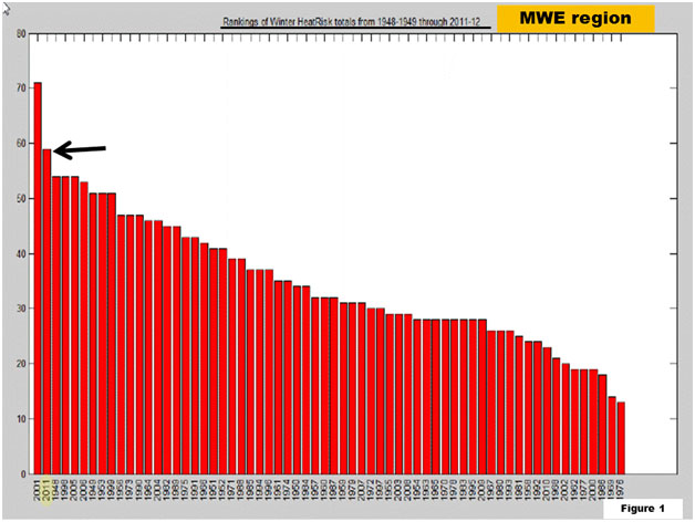 FIG. 1. Plot of HeatRisk TempRisk signals for the Midwest East USA (MWE). The arrow and yellow oval point to 2011 (second warmest) and the historical record for DJF is from 1948-49 to 2011-12. The abscissa is years and the ordinate is the number of daily HeatRisk events through about mid-February.
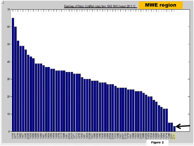 FIG. 2. Same as Fig.1 but for ColdRisk. DJF 2011-12 has the lowest frequency of ColdRisk events since 1948.
The purpose of this document is to: 1) explain some of the planetary-scale differences between the 2011-12 winter and previous two, and 2) illustrate the performance of TempRisk. The latter is done by first, comparing large scale circulation characteristics to TempRisk patterns; and then illustrating a specific case study representative of the 2011-12 winter. A detailed scientific attribution is well beyond the scope this paper. Please contact EarthRisk Technologies if that is your interest.
2. Large-scale settings and TempRisk
Figure 3 presents a series of maps illustrating jet stream winds and pressure patterns at roughly 18000 feet (top) with surface air temperature anomalies (bottom). The sequence begins with DJF (December-January-February) 2009-10 on the left to DJF 2011-12 (through 19 February) right. As annotated, DJF 2009-10 was an El-Niño winter while the next two were La-Niña (see Fig. 4). Broad brushing, the circulation responses during 2009-10 and 2011-12 were consistent with composites of the ENSO (El-Niño/Southern Oscillation) - cycle . The winter of 2010-11 was decidedly an outlier (See Appendix 1 for composites).
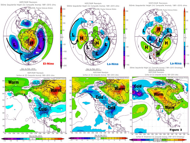 FIG. 3. Sequences of 500-mb (~18000 feet above mean sea-level (MSL)) composite height anomalies (meters; top) and temperature anomalies (degrees Centigrade; bottom) for DJF. The progression is from 2009-10 (left) to 2011-12 (right; through Feb. 19). "Hs", "Ls" and bold arrows on top denote implied regions of high and low pressure along with approximate positions of the jet stream, respectively. Notice slight scaling differences.
Observe that even though the ENSO situations were completely different, the winters of 2009-10 and 2010-11 featured strong high pressures across the Polar Regions including the North Atlantic and Pacific Oceans. Also similar were jet stream winds which were well south of climatology (bold arrows) across the lower 48 states. This allowed anomalously cold air to be delivered southwards (see bottom panels).
The winter of 2011-12 has been opposite in many respects including the jet stream shifted well north of climatology across North America. This has kept the Arctic airmasses "bottled up"; for example, across Alaska (upper and lower right maps). While contracted polar low pressure is not unusual for La-Niña, the 2011-12 winter has been exceptional. For instance, the warm anomalies dominating Canada is not consistent with the La Nina composite (which indicates that Canada should be colder than normal).
Figure 4 is a sequence of global sea surface temperature (SST) anomaly maps during DJF with the exception of the lower right that shows a recent climatology of actual SSTs. Ocean surface temperatures help weather-climate scientists diagnose jet stream patterns. The 2009-10 El-Niño and 2010-11/2011-12 (only DJ for 2011-12) La-Niña's are annotated. Notice there are SST differences across the tropical Indian and Atlantic Oceans (colored dashed ovals) which may help explain some of the circulation characteristics observed over the past 3 winters (e.g., see . Shin, S.I., and P. D. Sardeshmukh, 2011: Critical influence of the pattern of tropical ocean warming on remote climate trends. Climate Dynamics, 36, 7-8, 1577-1591. DOI: 10.1007/s00382-009-0732-3 Published Online 23 January 2010 and references therein).
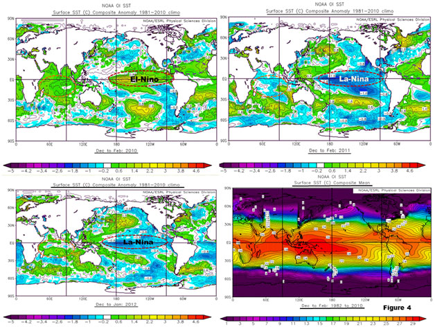 FIG. 4. Maps of sea surface temperature anomalies for DJF 2009-10 and DJF 2010-11 (top, left-right) and DJ 2011-12 (lower left). The lower right plot represents the 1982-2010 climatology for DJF, essentially what was used to compute the anomalies. Units are degrees Centigrade.
So, arguably there have been some unique atmospheric behaviors during the last 3 winters. Can TempRisk diagnose and predict some of the large-scale and persistent aspects of the circulation? Figure 5 offers some answers to this question.
The top panel of Fig. 5 is a "repeat" of the Fig. 3 jet stream maps. The bottom sequence of vertical charts is a sample of the patterns TempRisk uses correlate to HeatRisk and ColdRisk events out to 40-days (monthly subseasonal; not seasonal). Arrows and ovals are annotated to show that yes, indeed there are signals in TempRisk which do capture the circulation characteristics of these 3 very different winters. Please keep in mind it is the shape of the patterns which are important, not the distribution of the "colors" on the lower vertical panel of maps. A representative case study demonstrating performance of the TempRisk during the mild winter of 2011-12 is given in the next section.
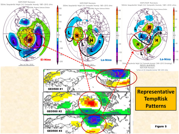 FIG. 5. Same as Fig. 3 for top. Bottom is a sequence of 3 patterns of 500-mb height anomalies (labeled) used by TempRisk to capture corresponding distributions in the atmosphere. Ovals and arrows depict the relationships.
3. Representative case study for 2011-12 winter
The focus of this case is on the Midwest East US (MWE) geographical region of TempRisk (see Appendix B). Multiple meteorological time scales influenced the weather across the MWE during the 2011-12 cold season. These included: 1) trend, 2) La-Niña, 3) subseasonal variations, and 4) synoptic behaviors.
Figure 6 illustrates a percentile time series of HeatRisk for the MWE from 11/25/2011-1/1/2012. The historical record is from 1948-2011 (63 years) and the threshold is 71%. Observe there are instances of warmth separated by roughly 5-10 days. This indicates a persistently above normal temperature pattern having variations modulated by "day-to-day weather". Discussion concentrates on the "heat spike" that occurred 12/15.
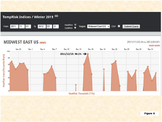 FIG. 6. Percentile time series (1948-2011 historical record) of HeatRisk for the MIDWEST EAST US (MWE) during 11/25/2011 to 1/1/2012. The threshold is 71%. Annotated is the 12/15/2011 (98.1% percentile ranking) target forecast date for case study in Section 3.
The evolution of key TempRisk signals beginning ~12/1/2011 is addressed focusing on those most relevant to the atmospheric circulation leading to the HeatRisk Event. A lead-time of approximately two weeks is used to illustrate this forecast success because atmospheric predictability decreases rapidly after a couple weeks beyond day zero.
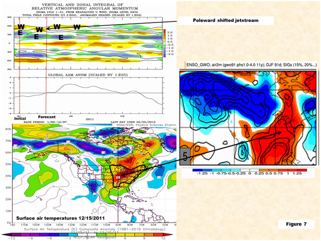 FIG. 7. Upper left: Plot of a measure of global wind strength (bottom panel) and contributions from various latitude bands (top panel), "E" and "W" refer to easterly and westerly wind flow anomalies, respectively. Lower left: Surface air temperatures 12/15/2011 using reanalysis data. Units are whole degrees Centigrade. Black outline is the approximate geographical MWE region. Middle right: Composite probability temperature map derived from upper left plot. Isopleths are odds of being in an upper or lower decile starting at 15%, 5% intervals, and units are tenths of a degree Centigrade.
Referring to the upper left plot, the vertical red dashed lines indicate forecast initial conditions (~12/1) and target forecast date (~12/15). For our purposes, simply notice the easterly ~30N (labeled as "E") and westerly wind departures ("W") near 55N around 12/1. With slight variations this pattern continued throughout December. Physically, this is a symptom of a poleward shifted jet stream which keeps Arctic air from penetrating into the lower 48 states (recall Figs.3 and 5). A response such as this is consistent with La-Niña, and would favor anomalous warmth for the MWE. Indeed, the composite temperature probability map (middle right) is similar to the observed surface air temperature plot (lower left). Probabilities of a decile event (warmest/coldest 10%; solid isopleths) are more than double their climatology, i.e. they are greater than 20%. Most of the events in Fig. 6 reach this magnitude, especially on 15 December.
The Northern Hemispheric scale synoptic component to the zonally symmetric wind distributions shown in the upper left plot of Fig. 7 is given in Fig. 8 during the period relevant to the case study. Observe that the jet stream was displaced considerably north of climatology from 11/25-12/15/2011 (large left map) encircling Arctic low pressure, consistent with upper right plot in Fig. 3. The smaller map to the right depicts one of the large-scale TempRisk patterns "triggered" on 12/1 for the same atmospheric height (~18000ft MSL) which captured much of the observed circulation characteristics. The similarities are pronounced, and were important for TempRisk to suggest mid-December 2011 anomalous warmth for the MWE (more said below).
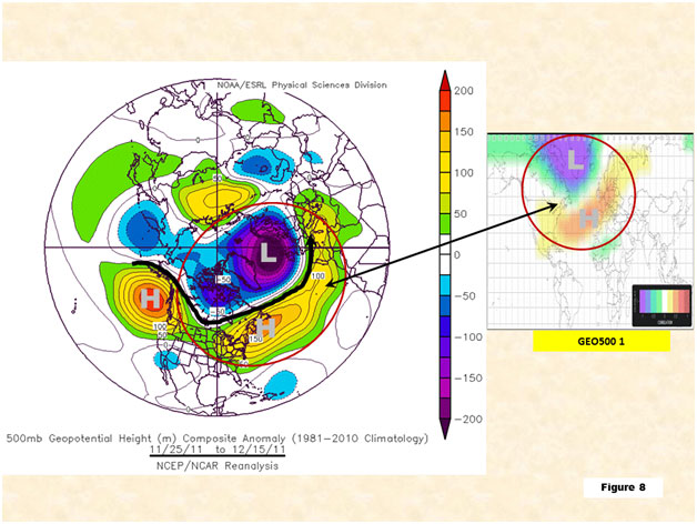 FIG .8. Large left map is the same as the top panel of Fig. 3. Smaller right inset is the GEO500 number 1 TempRisk pattern for 500mb height anomalies. The double arrow and red ovals denote areas where the spatial geometries are similar.
The 4-day and 11-day window from the TempRisk Matrix for MWE heat risk are given in Figs. 9-10. The initial times and forecast dates for the case study are annotated on Fig. 9. On both panels notice there is a lot of red, meaning TempRisk correctly latched on to a persistent MWE warm signal, consistent with a La-Niña base state. This case study is an example of cooperation between "everyday weather" during the winter of 2011-12 and La-Niña.
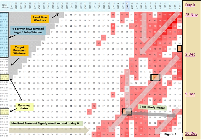 FIG.9. Heat risk temperature matrix for MWE using 4-day windows initial conditions as well as the intervals used to compute the 11-day cell for this case. (Fig. 10). These are annotated with matching shaded rectangles (yellow and blue, respectively). Gray arrows depict signal progressions in this matrix (see text). Darker gray arrow is case study signal.
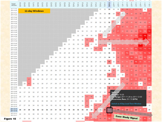 FIG. 10. Same as Fig. 9 but with 11-day windows.
There are advantages and disadvantages to using 4-day/11-day prediction windows. The former offers statistically independent initial conditions while the latter "smooths" the noise often observed in the 4-day Matrix. For this case the 11-day window indicates a 61% percent probability of warmth but with a limited sample size for lag 10-20 and target window 13-16 Dec. The 4-day window gives 56% but with a larger sample of underlying TempRisk patterns. Since the climatological HeatRisk in the MWE is 31% the latter suggests ~25% probability shift toward warmth assuming a bell-shaped historical temperature distribution. That is a strong signal, and care must be taken to properly interpret the implications.
Observe on Fig. 9 the lightly shaded gray arrows. The diagonal one starting at the 40% probability leads 1-4 represents a time evolution emanating from the initial conditions while the vertical arrow beginning at the 56% probability leads 12-15 apparently captures a quasi-persistent signal linked to La-Niña . The 23% probability shift toward warmth is at their intersection. In other words, the La-Nina or persistent aspect of the circulation was strongly influencing day-to-day weather. This is an example where TempRisk can be used as a forecast diagnostic.
The dark gray arrows on Figs. 9-10 show what the forecast signal progression would be if TempRisk performed "ideally". Observe for the 11-day windows the higher probabilities due to non-independent initial conditions accumulated over multiple initializations.
The next two schematics help to analyze the light gray diagonal arrows just discussed on Fig. 9. We start at the signal maps for the 6-9 day window (Fig. 11) and end with those for the 12-15 day window (Fig. 12), both of which are based on 12/1/2011 initial times. The dashed vertical lines on Fig. 11 and 12 highlight the initial and final forecast times.
The loss of day to day weather influences will decrease the number of these signals as lead-time increases. However, key large-scale patterns consistent with La-Niña were maintained. Their spatial patterns are shown on the right hand sides and their time evolution is depicted to the left. Notice that while there were variations of signal strength of the "black oval patterns", the heavy line segments show persistence for more than a month that are in excess of statistically significant thresholds. There was a tendency for the patterns to represent circulation features similar to the composite La-Niña base state and thereby constructively interfere with La-Niña forcing during ~mid-December, consistent with the intersecting arrows shown in Fig. 9.
Recalling Figs. 3, 5 and 7, these patterns are consistent with an anomalously poleward shifted jet stream over the North Atlantic Ocean (TempRisk pattern UWIND200 number 3) and colder than normal airmasses confined in the Arctic (TempRisk pattern AIRTEMP10 numbers 1, 5 and AIRTEMP 50 number 1). Furthermore, referring back to Figs. 3 and 8, TempRisk captured an important circulation aspect for the 2011-12 winter: a retracted polar low pressure (TempRisk pattern GEO500 number 1) centered over the North Atlantic Ocean. Hence, considering all the above, TempRisk predicted a robust tercile warm signal roughly 15 days into the future that verified. Its apparent weakness in capturing the event in the short lead windows (i.e., 1-4, 2-5 day) is under review for improving future versions of TempRisk.
In terms of time scale, the persistent patterns above are accompanied by TempRisk pattern u200 number 12, which shows prominent ~15-25 day variations. In the positive phase, highlighted with arrows on Fig. 12 (bottom), the pattern describes split flow over the eastern USA region with the jet stream shifted poleward over Canada and southward over Central America. This subseasonal component, persistence and presumably a synoptic scale component (<10 day) contributed to the TempRisk event for the MidwestEast on December 14-16, 2011. TempRisk seems to capture some of the key patterns, but despite this the forecast signal on the TempRisk matrix (Figs. 9) is weak. Possibly other patterns and spurious signals mask it. Also, TempRisk pattern UWIND200 number 3 is merely the "geostrophic" zonal wind signal that accompanies the GEO500 number 1; i.e., the two patterns do not provide independent information about the circulation.
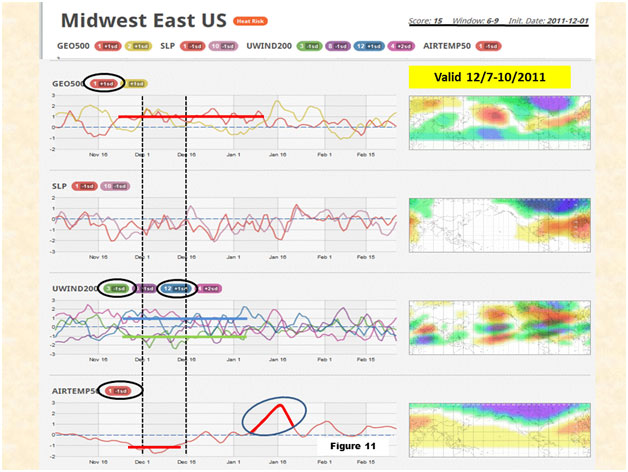 FIG. 11. MWE heat risk signals for the day 6-9 forecast window based on 12/1/2011 initial conditions (left black dashed vertical line). The ovals indicate patterns discussed in the Section 3 case study, and right black vertical dashed line is forecast date. The matching colored horizontal bars indicate pattern thresholds along their respective time series (keep in mind the algebraic sign). The large blue circle shown on bottom panel for AIRTEMP50 is discussed in the context of Fig. 13.
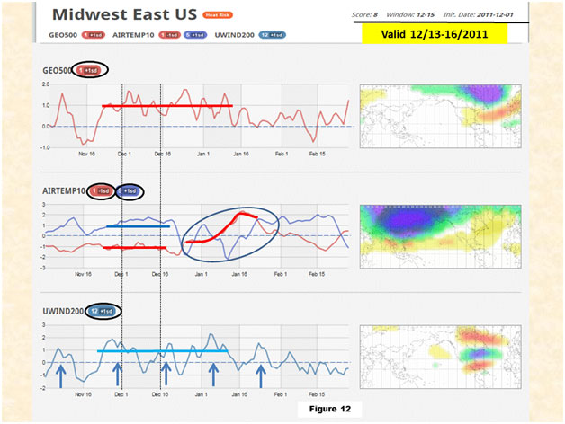 FIG. 12. Same as Fig. 11 but for the 12-15 day forecast window. The large blue circle along middle panel time series is in reference to Fig. 13.
4. Conclusions
A contrast was made between the atmospheric circulations during the winters (DJF) of 2009-10, 2010-11 and 2011-12. There was a lot of nervousness by meteorologists and the markets alike during fall 2011 that the upcoming winter would have a cold outcome similar to the previous two. Instead, essentially the opposite temperature response occurred; one of the warmest winters on record, especially for the MWE. TempRisk not only had the capability to distinguish the persistence in the large-scale patterns, but also make correct predictions of amplified warmth ~2 weeks in advance during the mild 2011-12 winter. A case study demonstrating the latter was presented.
TempRisk is one of the first successful and objective weather prediction tools for subseasonal forecasting. Of course, there is always room for improvement and such work is ongoing. Figure 13 is the cold risk TempRisk matrix for the MWE spanning 1/15-2/21/2012. A spurious cold risk signal was predicted starting mid-January (diagonal light yellow arrow). This did not verify. A complicated atmospheric process (inset) triggered the patterns indicated by the large blue circles annotated on Figs. 11-12. A case study is planned for this event.
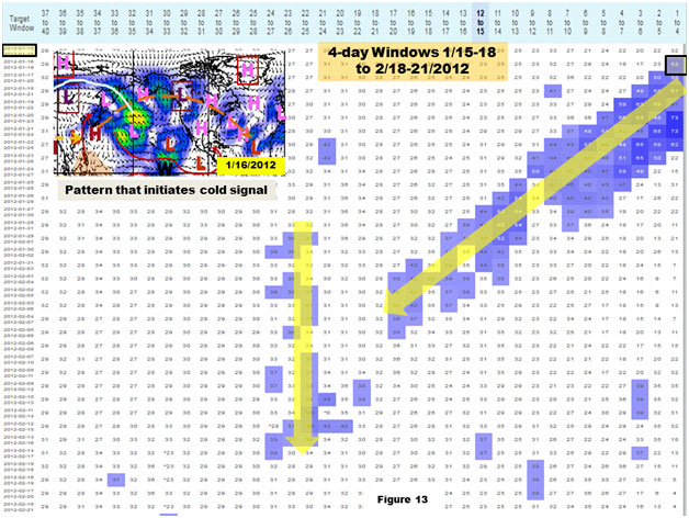 FIG. 13. Cold Risk 4-day window matrix for the MWE valid 1/15-2/21/2012. Light yellow arrows denote spurious signals, and inset represents a component of the atmospheric processes responsible for them.
APPENDIX A
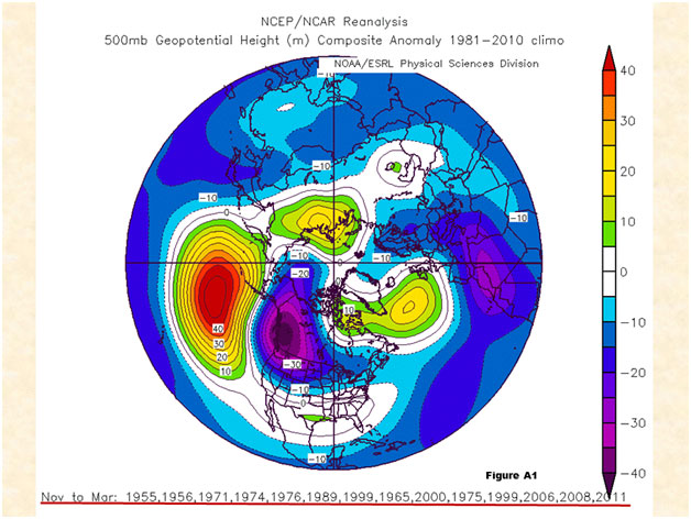 FIG. A1. 500-mb composite height anomalies (R1 data) for La-Niña years during November-March. Units are in whole meters using the 1981-2010 climatology. Years used are underlined in red, with the last month of the season indicated (e.g. Nov to Mar 1955 refers to NDJFM 1954-55).
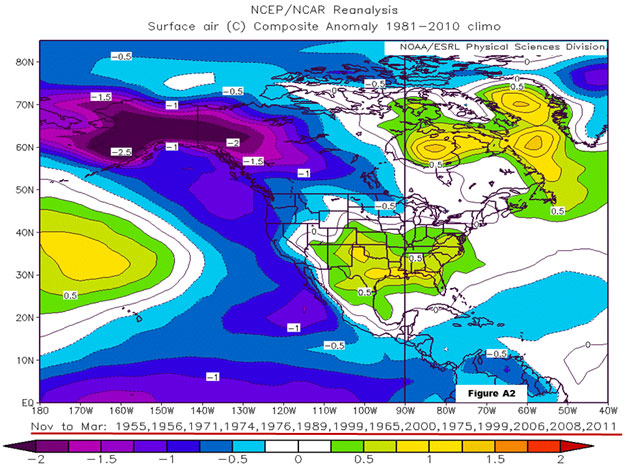 FIG. A2. Same as A1 but for surface air temperature. Units are tenths of a degree Centigrade.
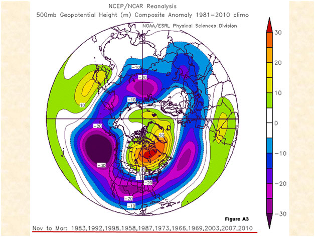 FIG. A3. Same as A1 but for El-Nino years.
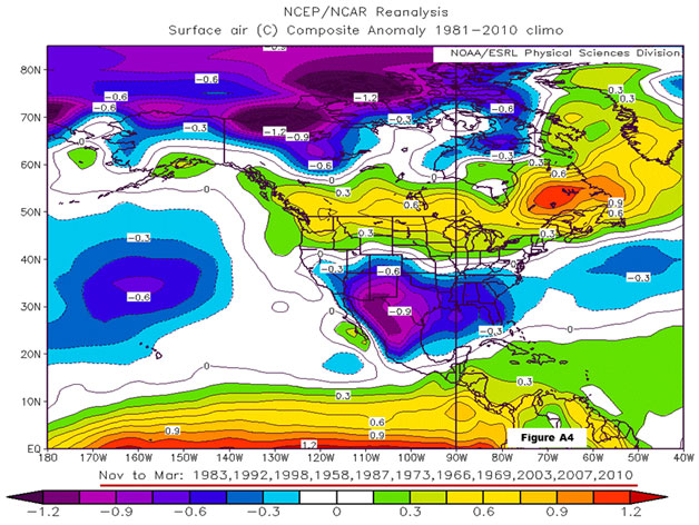 FIG. A4. Same as A2 but for El-Nino years.
APPENDIX B
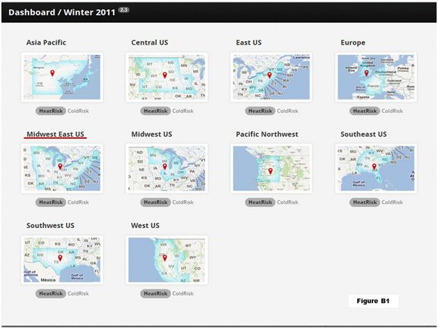 FIG. B1. Dash board from TempRisk indicating geographical regions. The Midwest East US (MWE) region discussed in Section 3 is underlined in red.